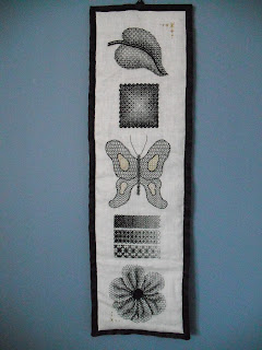
Firstly, here is the sampler I made for my mum with its backing done so it is ready to be displayed:
Now on to the next project. I bought a few pots of fabric paint (brown, gold and bronze) and attacked a piece of evenweave fabric so it is an uneven colour. I started by soaking the fabric in diluted brown paint so that there would be no completely white sections left then used the brown paint to darken some areas. Finally I added the gold and bronze for texture and sparkle. Since the design plan is to go back to the autumn leaf I did on my previous set of colour experiments, the background is supposed to be vaguely treelike in its shape. I will do five different shaped leaves using coloured shading with a few gold and bronze ones using very thin sparkly thread in the background. It will be a bit abstract and muted. Here are the materials:
I am at the opposite end of the country from my collection of embroidery silks at present to I just chose a few colours that seemed to work well together. However I quickly hit on a snag:
The yellow thread I selected in the shop turned out to look pale brown when used against a brown fabric rather than a white one. It also blends in with the background so that it is virtually invisible. The similarity in colour between the 'yello' thread and the background also means that the orange stands out hugely and doesn't blend together as well as it looked like it would. From a distance the situation is even more obvious:
Only the orange shows up at all. I need to re-think this. I really like working on a coloured background but in future I need to have it with me when I select the colours I will use since it has a knock on effect on all the rest of the colours used. I have found an interesting looking book on using colour in embroidery which I hope to get for my birthday so I plan to work on thus more in the future. In the mean time I need to rethink my colour choices on this piece.


No comments:
Post a Comment